Web & Mobile Development JLW288
09.Responsive.
Web.Design
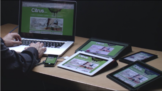
Responsive Web Design
Hey, look! I found a robot fossil!
Responsive Web Design?
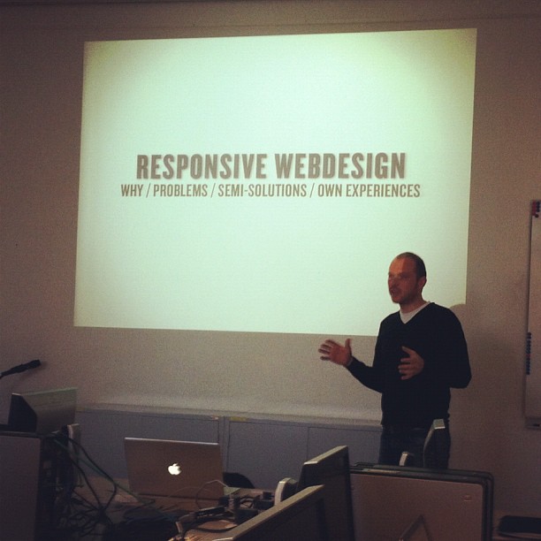
Responsive Web Design
Responsive design refers to an approach in web design that provides an optimal viewing experience across a wide range of screen resolutions and devices. This includes easy reading and navigation with a minimum of resizing, panning, and scrolling. This is accomplished using the same codebase and content, instead of separate sites for different devices.
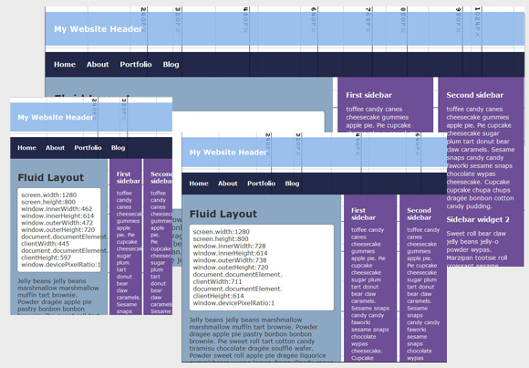
Practical: Fluid Layouts

I'm not sure. I'm afraid we need to use ... Math.
Practical: Fluid Layouts
-
Two steps to converting a pixel based layout to a fluid one
- Convert the grid used to percentage based values
- Convert the font-sizes used to em based values
-
Magic formula:
target / context = result
Flexible Grid (1)
-
Let's start from this basic, pixel based, grid

Our basic grid
Flexible Grid (2)
-
Code is pretty straightforward
<div id="wrapper" class="clearfix" style="width: 960px;">
	<section id="secondary" style="width: 320px; float: left;">
		...
	</section>
	<section id="primary" style="width: 640px; float: left;">
		...
		<article style="width: 500px; float: left;">
			...
		</article>
		<aside style="width: 140px; float: left;">
			...
		</aside>
	</section>
</div>
Flexible Grid (3)
-
Conversion to percentages via our magic formula
target / context = result-
#secondarytarget= width the box should be = 320pxcontext= width of its parent#sitewrapper= 960pxresult= 320px / 960px = 33.333333%
-
#primarytarget= width the box should be = 640pxcontext= width of its parent#sitewrapper= 960pxresult= 640px / 960px = 66.666667%
-
Flexible Grid (4)
-
Conversion to percentages via our magic formula
target / context = result-
articletarget= width the box should be = 500pxcontext= width of its parent#primary= 640pxresult= 500px / 640px = 78.125%
-
asidetarget= width the box should be = 140pxcontext= width of its parent#primary= 640pxresult= 140px / 640px = 21.875%
-
-
Finally, change the
widthof the#wrappertomax-width
Flexible Grid (5)
-
Resulting code
<div id="wrapper" class="clearfix" style="max-width: 960px;">
	<section id="secondary" style="width: 33.333333%; float: left;">
		...
	</section>
	<section id="primary" style="width: 66.666667%; float: left;">
		...
		<article style="width: 78.125%; float: left;">
			...
		</article>
		<aside style="width:  21.875%; float: left;">
			...
		</aside>
	</section>
</div>
Flexible Grid (6)
-
Other horizontal values such as margins and paddings are converted like you'd convert the width
target= target padding/margin you wantcontext= width of the parent
-
Converting vertical values of the grid are a tad tricky, as percentages don't work
- Use
emfor those instead
- Use
Flexible Font Sizes (1)
- Setting the
font-sizeto anem-based value will allow fluid font-sizes- An
emis a relative unit 1em= the font-size of the current context- By default the context is the
<body>, which defaults to 16px
- An
-
Let's take this example
<h1 style="font-size: 28px;">This is a test <small style="font-size: 16px;">and only a test</small></h1>
<p style="font-size: 13px;">I'm not kidding!</p>
Flexible Font Sizes (2)
-
Conversion to percentages via our magic formula
target / context = result-
h1target= the font-size it should be = 28pxcontext= the font-size of its parent,body= 16pxresult= 28px / 16px = 1.75em
-
ptarget= the font-size it should be = 13pxcontext= the font-size of its parent,body= 16pxresult= 13px / 16px = 0.8125em
-
Flexible Font Sizes (3)
-
Conversion to percentages via our magic formula
target / context = result-
smalltarget= the font-size it should be = 16pxcontext= the font-size of its parent,h1= 28pxresult= 16px / 28px = 0.571428571em
-
Resulting code
<h1 style="font-size: 1.75em;">This is a test <small style="font-size: 0.571428571em;">and only a test</small></h1>
<p style="font-size: 0.8125em;">I'm not kidding!</p>
-
Closing Notes / Tips
-
Don't round the values that you've calculated.
- 0.5em is not the same as 0.571428571em!
-
Set the (max-)width of the wrapper in
emtoo -
When working with border use
box-sizing: border-box;to adjust the box model being used-
That way the rendered width will be the CSS
widthyou specify; the padding and border won't be added to it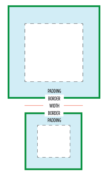
-
That way the rendered width will be the CSS
Do I really need this em stuff?
- Yes! It allows one to easily scale up/down a site: just adjust the
font-sizeof the<body>and everything else will scape/up down with it!

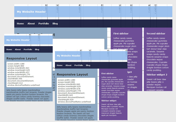
Practical: Media Queries

The flight had a stopover on the Brain Slug Planet. Hermes liked it so much he decided to stay of his own free will.
The “problem” with fluid
- Fluid grids/font-sizes alone won't save you
- When the viewport becomes too narrow, it will look crappy
-
Need to change the layout when necesarry
- Enter, stage left: CSS Media Queries!
Plan Ahead (1)
- Stop & think! Don't jump into your CSS editor and start coding but plan ahead.
-
Make sketches, or a prototype at the various widths
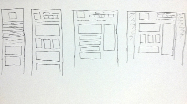
Image by Webdesigner Depot
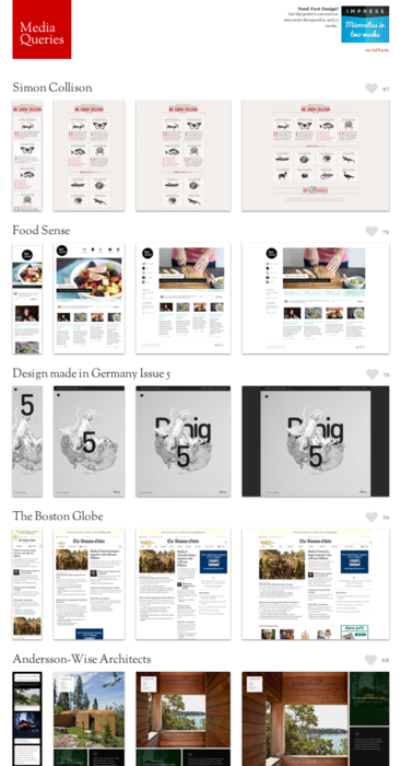
Plan Ahead (2)
-
Be inspired by sites such as Mediaqueri.es
Think Mobile First & Focus
-
Layouting the mobile view of the site first forces you to focus on what really matters: the content
Implement Mobile First & scale up (1)
-
Slice and code the smallest layout you've created,
then augment upwards/* General CSS (fonts, colors, etc) + Mobile First Layout */ html { ... } body { ... } h1 { ... } header { ... } section#main { ... } /* From 360 pixels width and up */ @media (min-width: 360px) { /* note: all styles above will be inherited! */ h1 { ... } section#main { ... } }
Implement Mobile First & scale up (2)
-
Actually, define your media query
min-widthinem(src)/* General CSS (fonts, colors, etc) + Mobile First Layout */ html { ... } body { ... } h1 { ... } header { ... } section#main { ... } /* From 360 pixels width and up */ @media (min-width: 22.5em) { /* note: all styles above will be inherited! */ h1 { ... } section#main { ... } }
Implement Mobile First & scale up (3)
-
Include respond.js on your page to make oldIE interpret the rules
<!--[if (lt IE 9) & (!IEMobile)]><script src="js/respond.min.js"></script><![endif]--> -
Include a
viewportmetatag to let mobile browsers properly render the site<meta name="viewport" content="width=device-width, initial-scale=1.0" />
When to apply a different layout?
-
Don't use device breakpoints such as 320, 480, 768, etc.
- Devices will change.
- Screen-sizes vary, a lot: The trouble with Android
-
Do set breakpoints when the layout becomes awkward or unusable
- e.g. column becomes too narrow
-
You'll be doing this stuff a lot

What to change?
-
Font-sizes
- Change the basic
font-sizeofbodyand theems will do their work
- Change the basic
-
Positioning of the main boxes/containers
- Next to each other → Underneath each other
- Place text into CSS3 columns
-
Visibility of items
- Beware though, RWD is not only
display: none;
- Beware though, RWD is not only
-
Navigation is quite tricky
- Use one of the Responsive Navigation Patterns
-
Static elements vs. Interactive Elements
- eg. small screen device: image of a map
- eg. big screen device: interactive Google Maps interface
Practical: Fluid Media

Please Don't Drink The Emperor!
Fluid Images (1)
-
Prevent images from bleeding out of their fluid wrapper by limiting its
max-widthto100%img { max-width: 100%; _width: 100%; /* fix for IE6 who doesn't understand max-width */ }
Fluid Images (2)
-
Resizing imgs in the browser isn't bandwidth friendly
-
Some hacky solutions exist (list)
.htaccessredirect + resize script: Adaptive Images, Responsive-Images JS, etc.- Define bigger image as URL part or via data attribute: Responsive Enhance, etc.
-
The solutions above basically scale down the images on the fly. Most of the time it's better to have a resized + cropped version though

-
Some hacky solutions exist (list)
Fluid Images (2)
-
Resizing imgs in the browser isn't bandwidth friendly (continued)
-
A W3C community group is pondering how to properly fix it:
<picture alt="A giant stone face at The Bayon temple in Cambodia"> <source src="small.jpg"> <source src="medium.jpg" media="(min-width: 400px)"> <source src="large.jpg" media="(min-width: 800px)"> <noscript><img src="small.jpg" alt="..."></noscript> </picture> - Although not standarized yet, a polyfill already exists!
-
A W3C community group is pondering how to properly fix it:
Fluid Images (3)
-
Problem: Mobile != small bandwidth
- It's not because I am visiting a site on my mobile phone that I am on the road
- I can be connected over wifi
- I can be at home in my couch
- ...
-
The current proposal is lacking, one also needs to take connection speed into account
- The Community group is aware of this
- Some JavaScript based solutions already exist
Fluid Video
-
Same trick as for images works
video, embed, object { max-width: 100%; _width: 100%; /* fix for IE6 who doesn't understand max-width */ } - Use of fitvids.js is recommended, as it uses intrinsic ratios.
Practical: Tools

The Smell-O-Scope is brilliant, I tell you!
Easily test your layouts
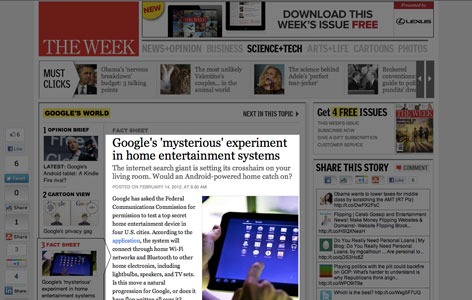
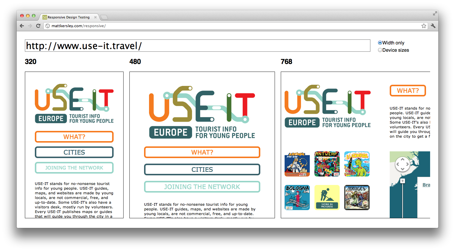
Test your layouts all at once
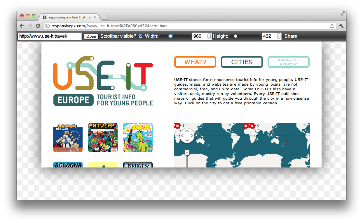
Find that tricky breakpoint
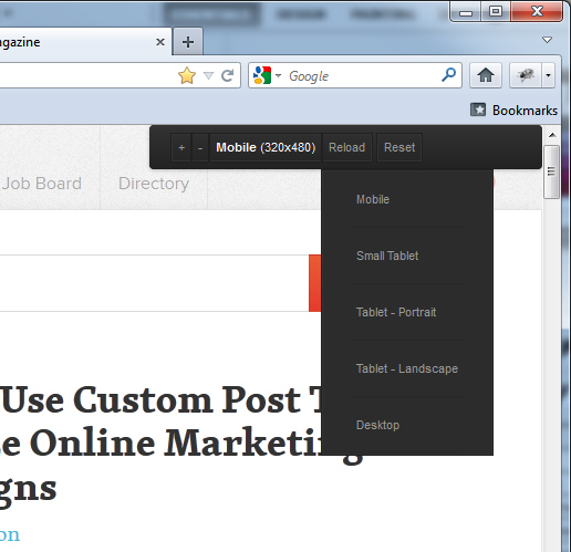
Test all mobile devices at once
Final Notes

Do you, Leela, copy and paste his response
till death do you part?
Solid foundations
- Structured and good HTML is a prerequisite before doing anything with CSS.
Future Friendly
-
We can't predict the future. Things will change
- New devices
- New ways to accessing information
- ...
-
Don't code for the proprietary solutions that exist now, but keep the future in mind, be future friendly
- Create meaningful content and services; Focus!
- Define your data in way that it's interoperable and can exist later on
- Structure and store your content so that it can be read by anyone, on any device, any time, in different contexts
There is no mobile web
There is no Mobile Web. There is only The Web, which we view in different ways. There is also no Desktop Web. Or Tablet Web.
Embrace the medium
If you just make an HTML-Document and you put it on the Web it’s already responsive.
— Jeremy Keith
No Silver Bullets (1)
-
Again ⚑:
If you're looking for the more honest, truthful answer to pretty much any question on web design and usability, here it is: It depends.
No Silver Bullets (2)
- RWD is not the answer to everything.
-
In some cases, you'll need a combination of techniques, a variant or an alternative
- eg. RESS: Responsive Design + Server Side Components
- Selectively deliver lightweight versions of some parts of your site to mobile devices
- eg. MVC with Form-Factor Specific Views
- eg. RESS: Responsive Design + Server Side Components
-
In some cases you will need a separate app/website
- Use The Gradient Chart to decide
Recommended Reading